Overview
Our colour system helps create clear visual hierarchy, convey meaning, and ensure accessibility across all our digital products. We use a systematic approach with colours that have meaning, and colours that don't, to maintain consistency.
- Use mainly black and white colours
- Favour strong contrasts for readability
- Use black, white, or grey for text
- Use expressive colours for infographics
- Create low contrast combinations
- Use colours for text
Colour distribution
Below is a visual guide showing the relative emphasis of our core brand colours across key touchpoints.
Colour system
To help with knowing when and how to use a colour, we've introduced a colour system that defines colours as brand and semantic colours.
A brand colour is a simple value stored against a variable that describes what it is. A semantic colour is a variable that describes how to apply that colour.

The reason we have this system is to provide meaning to our colours, make them easier to use, and unlock features like theming and global changes.
Colour usage
We are primarily a black and white brand. So keep this in mind when producing assets and keep things simple and clean throughout.
Applying colour
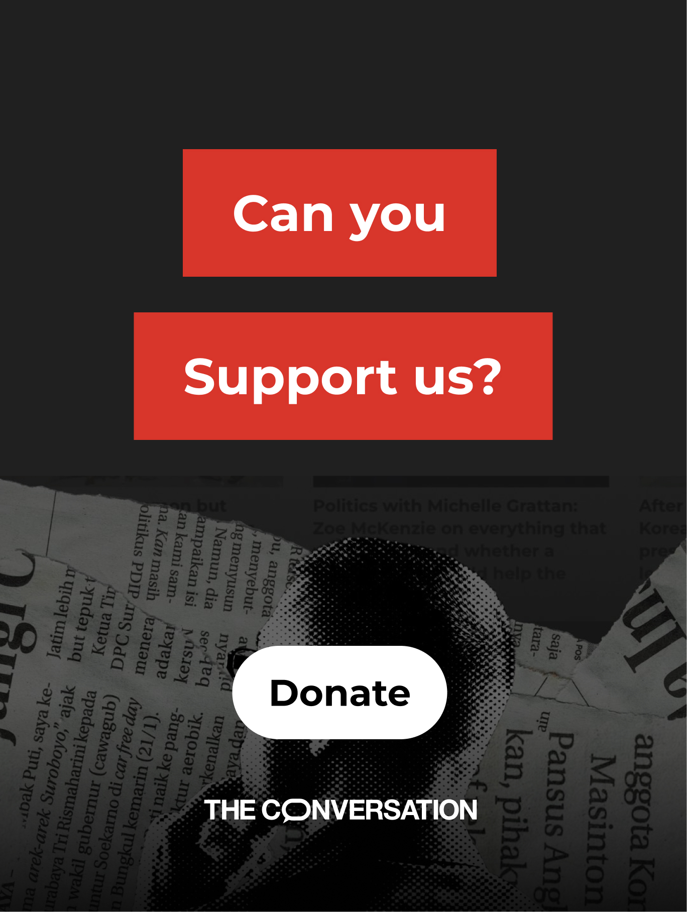
Use colours sparingly and primarily when amplifying a message or associating a colour with a particular product or feature, like associating newsletters with blue, or donations with red.

Do
Primarily black and white
Do
Donate post using red

Don't
Too many colours and not enough contrast

Caution
Using brand red for other than donation messaging can dilute it's meaning
Colour contrast
When overlaying text on top of colour, graphics, and images, ensure that there's enough contrast between the text and the background to meet our accessibility criteria.
When overlaying text on gradients or images, the contrast is measured where there is the least amount of contrast.

Don't